
δτενεη Μαsιnι 🇫🇷
shared a media post in group #Dogfood
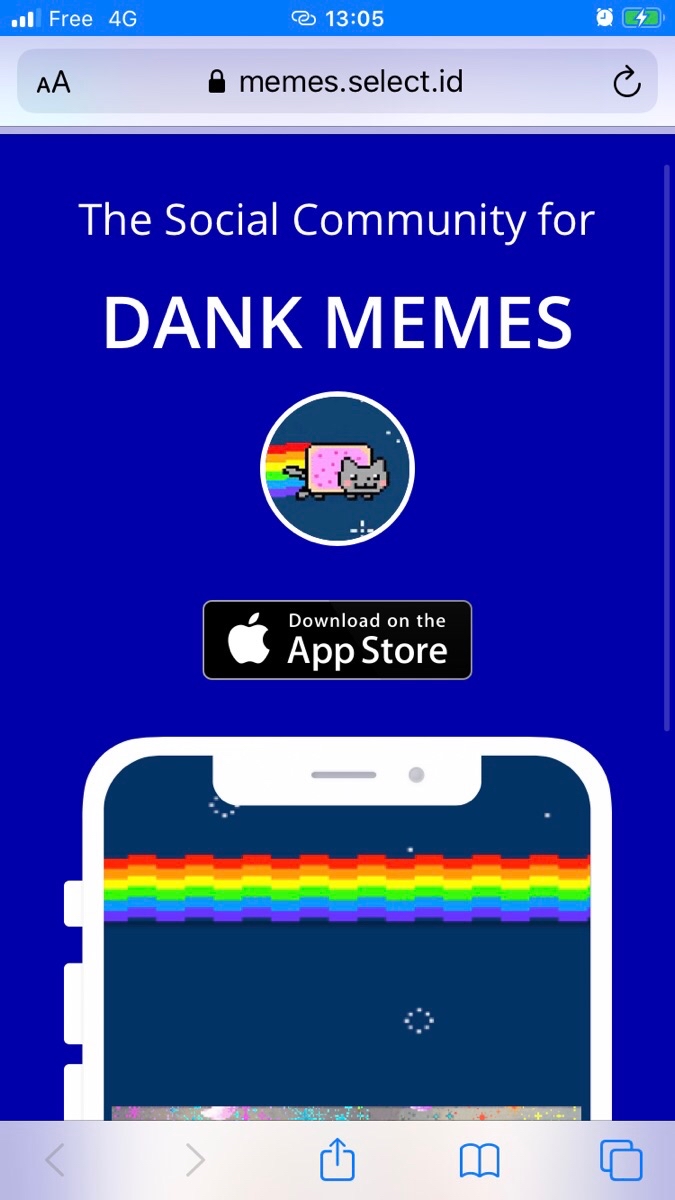
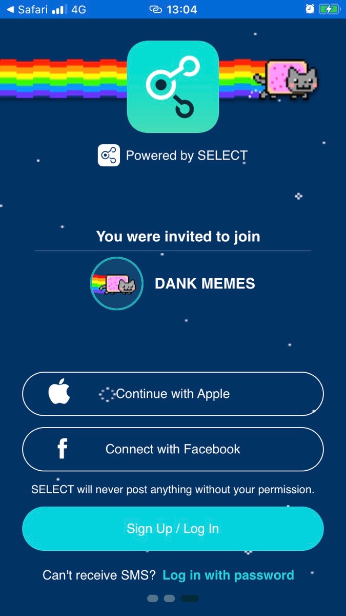
I have two feedbacks about the deeplink.
1- The call to action to download the app on the first screen isn’t clear enough. I think that should be a button instead of the Apple App Store badge.
2- I wouldn’t put the SELECT app icon on top of the second screen. When I designed my intro-screens I presumed that this would be left empty. Furthermore, following Apple Guidelines, they do not recommend to put any of your branding in your app. Once user has open it, he knows what app he has open. That’s of course not a strong guideline, just a recommendation from Apple. But I also believes that’s too much.